Fine Print on Type: The Best of Fine Print Magazine on Type and Typography
- Large Softcover
- San Francisco: Fine Print / Bedford Arts, 1989
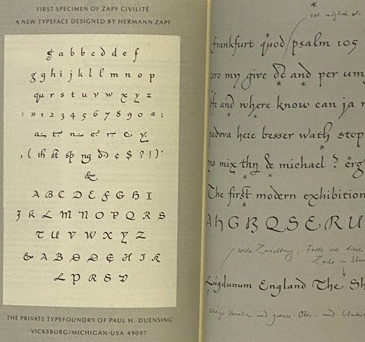
San Francisco: Fine Print / Bedford Arts, 1989. Large Softcover. Very Good. 0x9x12. Wrappers lightly toned, embossed owner stamp on title page. 1989 Large Softcover. 148 pp. A collection of essays on type design and typography, written by some of the foremost designers and scholars in the field. Appeals to those who use, study, and love type - from advertising designers to desktop publishers, from research bibliographers to just plain discerning readers. TYPE, seemingly a neutral conveyor, can radically affect the meaning and impact of the message. Types covered include the up-to-date and quotidian like ITC Zapf Chancery, Galliard, and Century, as well as little-known but interesting historical faces like Fleischmann Antiqua, Hiero-Rhode Italic, and Hammer Uncial. Here sixteenth- and seventeenth-century type designers like Claude Garamond and Miklos Kis share the stage with the "bit wizards" of our own time like Kris Holmes and Sumner Stone.